Your Storybook Is the Truth of Your Design System
Your Storybook is the code side of your design system. Write stories that match the design variant for variant, so design can trust what code renders.
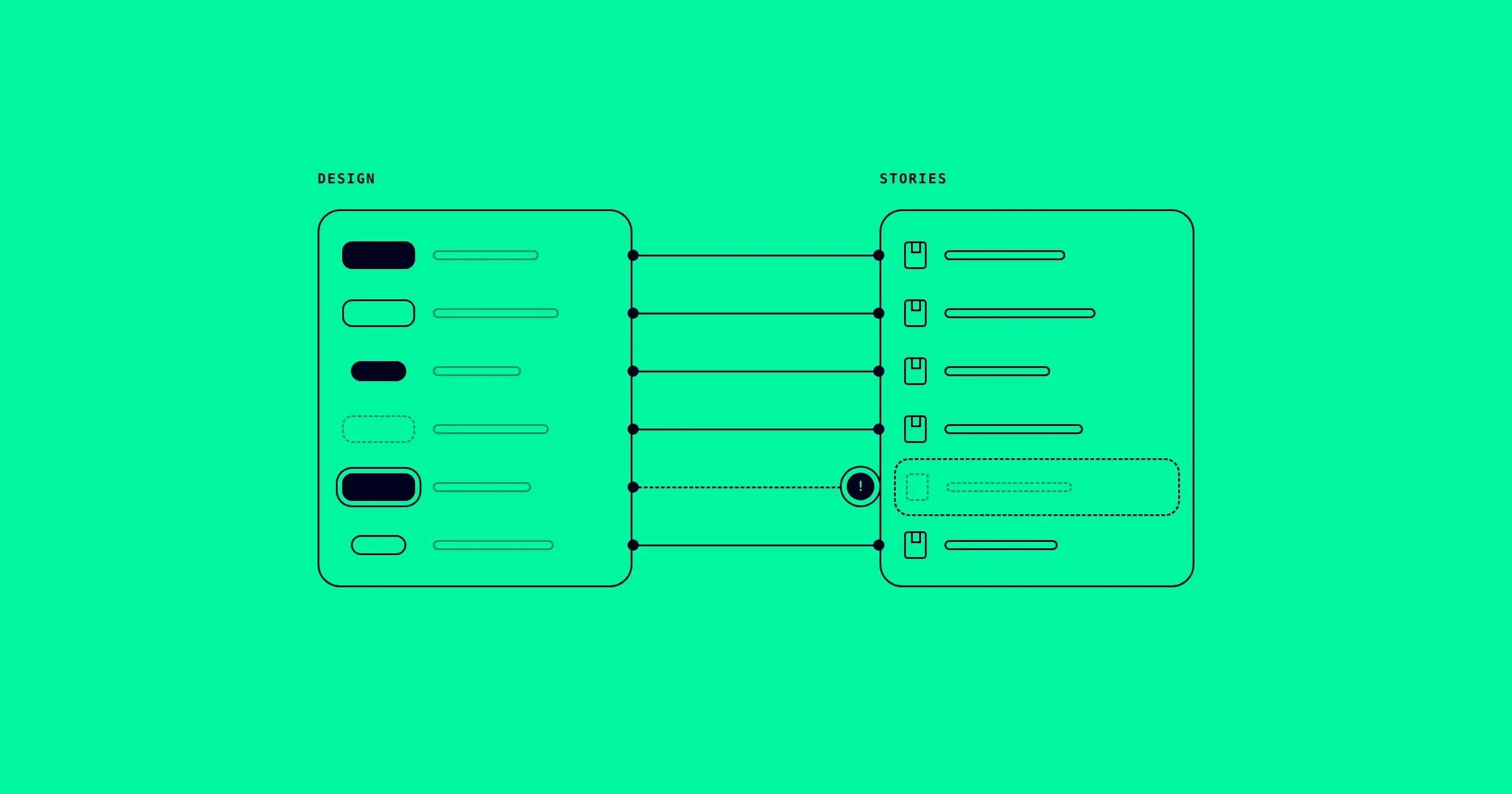
Open your Button in Figma and count its variants. Say it has three types, two sizes and four states: 24 variants the design promises. Now open its stories. In a typical repository there are five: Primary, Secondary, Ghost, Disabled, and a Playground with every control.
Nobody decided that 19 variants did not need to be seen. It happened one story at a time. A focus state was designed in March and never got a story. The small size was added to Figma and the stories never caught up. The design shows what the component should be. Storybook shows only the part of it someone thought to write down.
That gap matters more than it looks, because Storybook is the closest thing your codebase has to a truthful picture of its own components. This post is about making that picture complete: what a story needs so design can trust it, and a coverage check you can run on Monday.
Why Storybook is the code side's truth
There are three places to look at a component in code: its source, the product, and its stories. Only one of them is good for comparison.
The source tells you what the code says, not what it renders. A prop can be passed and ignored. A class can be overridden three files away. A token can resolve to a different value than its name suggests. You cannot compare source with a design frame.
The product renders the component for real, but surrounded by everything else: page layout, overrides at the call site, whatever data happens to be on screen. When something looks wrong on a page, you cannot tell if the component drifted or the page did.
A story is the component rendered on its own, from its real source, with props you chose. That is exactly what a design variant is on the Figma side: one component, one set of property values, nothing around it. A story is the only place where code can be put next to its design and compared like for like.
It is also why render-based comparison in deeepSpace reads Storybook. deeepCLI discovers your components and reads their stories to see each one across states and variants. Then each design variant is rendered from code with matching props and compared on its own. A variant with no story to render it from is a coverage gap: designed, and never seen in code.
What makes a story comparable
A story can exist and still be useless for comparison. These five rules make a story something design can trust.
1. One story per design variant. Not one Playground with controls. A Playground is useful for exploring, but it renders one combination at a time, chosen by whoever is clicking. If the design has a Type=Ghost, Size=Small variant, it needs a story that renders exactly that.
2. Args named after the design's properties. If Figma says Type=Primary, the story should set the prop that carries that value, and the mapping should be obvious to a person reading both. Figma's Type=Primary maps to variant="primary" in code. Write it down once, in the story, and keep it the same everywhere.
3. States are stories too. Hover, focus, pressed and disabled are variants in the design. In code they are often left to "you'll see it when you interact". A disabled state is easy: it is a prop. A focus state needs the component to actually receive focus, which a play function can do.
4. No decorators that change the component. A decorator that adds padding around the story is fine. A decorator that wraps the story in a different theme, a different font size, or a container that overrides styles is not. If the story renders something the product never would, comparing it proves nothing.
5. Real tokens, not story-only values. Stories should load the same styles and tokens the product loads. A stories setup with its own copy of the theme is a second source of truth, and it will drift from the first one quietly.
The coverage check (30 minutes)
Pick your most used component. Make two lists.
The design list. In Figma, open the component set and write every variant as its property values. For a Button: Type × Size × State.
The story list. In the stories file, list every named export. In Storybook's standard format, each one is a story:
grep -n "^export const" src/components/Button/Button.stories.tsxNow match them, one row per design variant:
| Design variant | Story | Status |
|---|---|---|
Type=Primary, State=Default | Primary | covered |
Type=Primary, State=Disabled | Disabled | covered |
Type=Primary, State=Focus | none | gap |
Type=Primary, Size=Small | none | gap |
Type=Ghost, State=Default | Ghost | covered |
Illustrative rows. Your component will have its own.
Count the gaps. Then write the missing stories, starting with the states users depend on: focus first, because keyboard users cannot see where they are without it, then the smallest sizes, because those are where tap targets shrink.
Here is a Button stories file that covers the design instead of sampling it. It uses Storybook's Component Story Format (CSF 3) with React:
import type { Meta, StoryObj } from '@storybook/react';
import { userEvent } from '@storybook/test';
import { Button } from './Button';

const meta = {
  component: Button,
  args: { children: 'Continue', variant: 'primary', size: 'medium' },
} satisfies Meta<typeof Button>;

export default meta;
type Story = StoryObj<typeof meta>;

// Type=Primary, Size=Medium, State=Default
export const Primary: Story = {};

// Type=Secondary
export const Secondary: Story = { args: { variant: 'secondary' } };

// Size=Small (44px tall in the design)
export const PrimarySmall: Story = { args: { size: 'small' } };

// State=Disabled
export const PrimaryDisabled: Story = { args: { disabled: true } };

// State=Focus: tab to the button so the focus ring renders
export const PrimaryFocus: Story = {
  play: async () => {
    await userEvent.tab();
  },
};
Two notes on the code. The import paths depend on your Storybook version and framework: on Storybook 9, the testing helpers come from storybook/test instead of @storybook/test, and the types from your framework package, like @storybook/react-vite. And the comments matter more than they look. Each one names the design variant the story renders, so anyone reading the file, including an AI agent, can see the mapping without opening Figma.
Run the check again after you add the stories. The number of gaps is your coverage, and it is a number you can track.
What stories cannot prove
A complete stories file proves that the component can render every variant the design defines. It does not prove the product uses it that way.
If a page overrides the Button's padding at the call site, the story is still correct and the page is still wrong. That is drift too, but it lives in the product, not the component, and Storybook will never see it. The token check from the five types of design system drift is how you find it: read the computed value on the real page and compare it with the design.
Stories also only stay true if they stay current. A story written in March for a design that changed in June is a confident picture of the wrong thing. The coverage check is not a one-time cleanup. It is a habit, run whenever the design side changes.
Let your stories do the comparing
Once your stories cover the design, they can do more than document it. deeepCLI reads them, and deeepSpace renders each design variant from code with matching props, compares it against the design, and marks anything it cannot compare as skipped, with the reason. The gaps you counted by hand become a list that updates on every sync.
Install deeepCLI and run deeep init, then deeep sync, in your repository. Sync your Storybook with deeepCLI and see every variant next to its design.